A crucial step in building strong brands is creating a strong alignment between the visual and verbal elements of the brand. The brand imagery, color palette, icons, typeface, and brand voice must all work in concert to create a solid foundation for the brand.
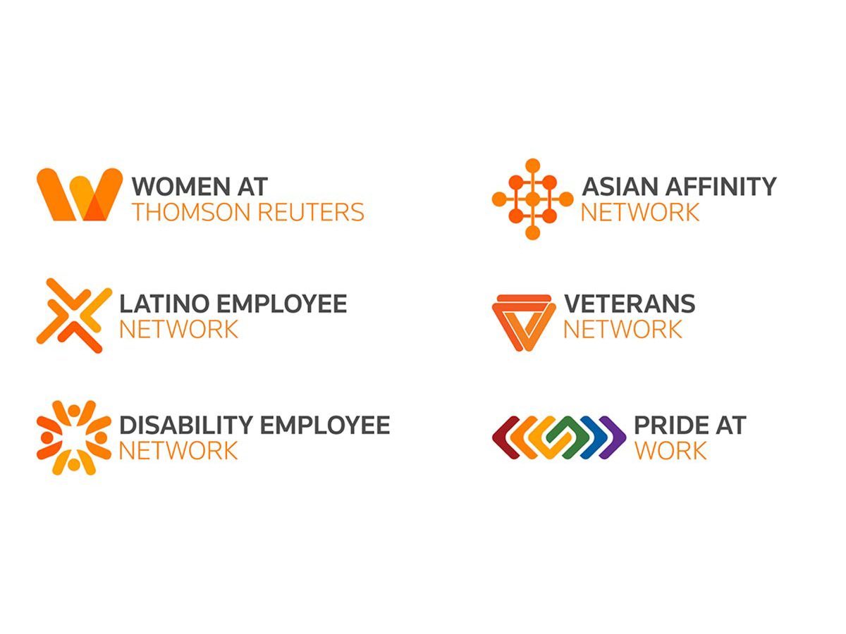
Recently, we created a logo family for the Business Resource Group at Thomson Reuters for internal use across the enterprise. This involved developing six logos to represent distinct interest groups, while conforming to the corporate brand standards. We spoke with Cleveland Design Creative Director Jenny Daughters to get her thoughts on the challenges and solutions involved when creating “internal brands within a brand.”
How do you balance conforming to corporate brand standards with creating distinct internal identities? How far can you push the brand?
That’s the fundamental question when designing for a company with strong brand standards. First and foremost, you need to truly understand the corporate brand in order to push it. You need to understand the essential elements that cannot be pushed and where you can find opportunities for creativity. That comes from years of working with a client’s brand. This experience enables me to “push until it breaks”—and then I can walk it back. So I can come up with something fresh and new, while still adhering to the core pillars of the brand.
These identities were created for multiple groups devoted to specific missions. How challenging was it to give each group its own identity?
When I started the project, I did so with a clear understanding that each group represented an issue or mission that employees are passionate about. At the same time, the logos had to function as part of a cohesive family. Dealing with this creative tension was the greatest challenge of this project. Each group had its own perspective, priorities and expectations. While acknowledging these, I needed to help them understand the overarching goal of creating a family within the brand standards, and the need to give me the freedom to do that.
During the discovery process, what influences did you consider for each group to make sure their visual identity represented their cause and interests?
At the outset of the project, I spent a great deal of time visiting each group’s intranet page to research their legacy visual identities—often these varied from region to region. I also spent time reading their posts to immerse myself in their group’s focus and ethos. This process was invaluable, giving me a deeper understanding of the mission and passion that animates each group’s identity. This research, together with the project kickoff call, gave me a good jumping off point.
As a designer with an outside agency, what is the process of working with internal brand managers when working on projects like this? And how do you balance this with the requests from the end client?
I made it a priority to meet with the corporate brand manager at the beginning of the project to gain her perspective on how the internal logos I was creating should work within the corporate brand framework. This was extremely helpful, giving me clear sense of how far I could “push” the brand and where the “guardrails” were. Throughout the process of creating my designs, I shared them with the brand manager to get her feedback before showing them to the end client. This collaborative approach was extremely productive, enabling me to be creative while staying within the bounds of what was acceptable.
I think this experience demonstrated a key part of my role as an external designer—serving as a bridge between corporate brand management and the business groups we work for and with. I believe that cultivating a good working relationship with the brand team is essential. This project truly was a partnership and I felt like part of the Thomson Reuters team, while bringing a fresh, external perspective to the assignment.
As you look back on this project and seeing the success of the finished product, what takeaways stand out?
As a designer, I felt that the resulting logos were all successful designs, so that was very personally rewarding. It was also rewarding to look at the six logos and truly see a cohesive family, yet each design was distinct. It was particularly gratifying that brand management supported the finished logos 100 percent. And that the end client was so pleased with the result and with my guidance during the process. That felt great.
As the design process progressed, we solicited feedback on the designs from the members of the six groups via online surveys. I got to read how my designs impacted employees. That was a rare treat, seeing how my work affected the employee experience. Everyone was positive about the designs. That made me feel good, that it was a job well done.


