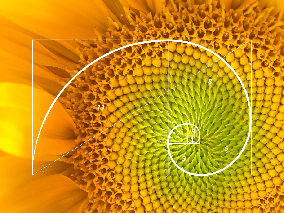
The great thing about being a graphic designer in the Boston area is having the opportunity to take in all the nature that presents itself in New England this time of the year. The sunflowers in my garden are tall, strong and they seem to keep the hope alive that summer is not quite over. But the best thing about the sunflowers is the incredible seed formation that bursts from the center of the flower. It’s nature at its best but also math at its best—it’s the Fibonacci sequence in action.
What is the Fibonacci sequence?
The Fibonacci sequence is one of the most famous formulas in mathematics. Each number in the sequence is the sum of the two numbers that precede it. So, the sequence goes: 0, 1, 1, 2, 3, 5, 8, 13, 21, 34, and so on. It’s been called “nature’s secret code,” and “nature’s universal rule.” Just take a look at the pattern it creates and you can instantly recognize how this sequence works in nature like an underlying universal grid. A perfect example of this is the nautilus shell, whose chambers adhere to the Fibonacci sequence’s logarithmic spiral almost perfectly. This famous pattern shows up everywhere in nature including flowers, pinecones, hurricanes, and even huge spiral galaxies in space. But the Fibonacci sequence doesn’t just stop at nature. In graphic design, we refer to it as the Golden Ratio. It can be applied to everything from logo design, print design and website design.
What is the Golden Ratio?
The Golden Ratio is a design concept based on using the Fibonacci sequence to create visually appealing proportions in art, architecture, and graphic design. The proportion, size and placement of one element compared to another creates a sense of harmony that our subconscious mind is attracted to.
To use or not to use
As designers, there are no rules when it comes to creating an aesthetic or an effective design for a project. Sometimes we find that the Golden Ratio works perfectly in application, while other times we come up with a great idea that doesn’t necessarily follow the rules. There is an ongoing debate among graphic designers, mathematicians and scientists about whether the Golden Ratio in relation to design is a myth. But there is plenty of evidence, not only in nature but in created design, that proves the ratio to be a solid tool for us designers. It can be a helpful when creating a grid for a layout, finding the perfect cropping for a photo, or figuring out sizes for type hierarchy when featuring content, just to name a few. Overall, it’s an interesting way to look at great design through a mathematical lens and we think it’s fascinating to identify where and how it is used in the world around us.
Intrigued? Here are some great examples of the Golden Ratio in action.

This work by Company Folders, Inc. is licensed under a Creative Commons Attribution 4.0 International License.


