
Brand consistency helps strengthen brand identity, which in turn builds trust with clients and customers. An important part of making sure that your brand is consistent is creating a uniform color environment. To achieve this, your brand should have defined print and web colors included in the branding guide. And here’s why…
CMYK (print) and RGB (web) colors have vastly different mixing processes, which can result in a huge color differential. With print, mixing all the colors (cyan, magenta, yellow and black) together results in black. The opposite is true for web – mixing all the colors (red, green and blue) together results in white. Because these two processes are so different, it gets complicated when converting one format to another. This is why we suggest all brands include both print and web colors in their branding guides, to remove any subjectivity for color interpretation.

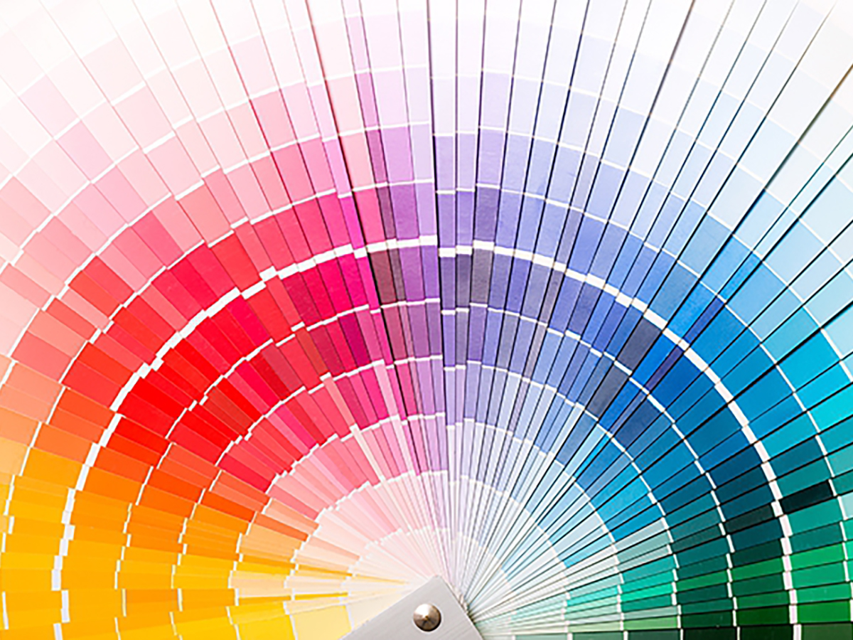
To throw another wrench into the mix, some brands have specified PMS colors. PMS, or Pantone Matching System, is a solid color ink that is blended to be a perfect match to the color guide every time. While PMS colors are also important for brand consistency, they are not always practical. So it is important to also have CMYK and RGB colors in your brand.
If your current branding guide does not include both print and web colors, you might have rogue colors on branded materials that don’t match the brand identity, causing confusion for your client or customer. Here at Cleveland, we have helped many of our clients develop full print and web branding guides. If you would like to discuss how we can help complete your brands identity with color consistency, contact us.