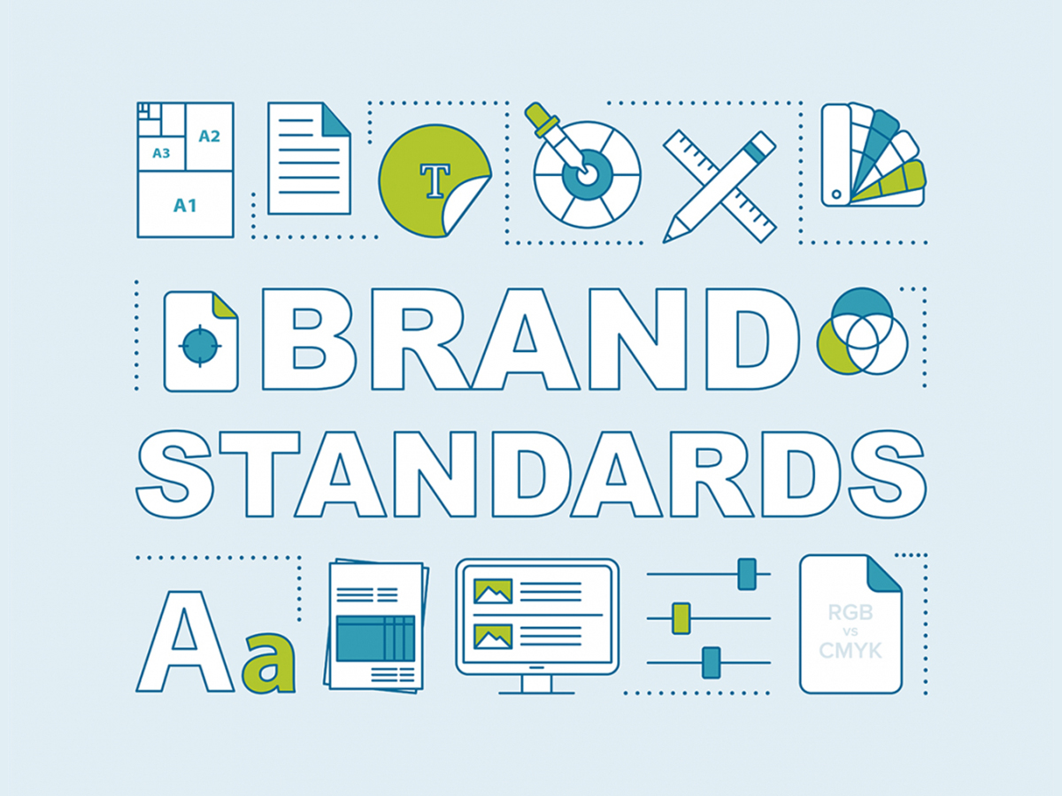
Does your company need a brand guide? The short answer is yes. Brand guidelines are essential for establishing and maintaining consistency across all of your brand communications and touchpoints. Everyone involved in brand building, from designers to CEOs, will be glad you have one.
But just having a guide isn’t enough – you need to make sure it is complete so anyone using your brand can start creating a consistent look.
Here is a handy list of the 8 essential things you should include in your brand guide. This will not only help designers and marketers, but anyone creating content for your company.
1. Mission Statement
No matter the size of your company, a mission statement can help define your goals and what your brand stands for. Having a strong, clear mission statement will help guide you through creating the rest of your brand.
Example mission statements
Amazon: To be Earth’s most customer-centric company, where customers can find and discover anything they might want to buy online, and endeavors to offer its customers the lowest possible prices.
LinkedIn: To connect the world’s professionals to make them more productive and successful.
Kickstarter: To help bring creative projects to life.
2. Logo
This may seem obvious, but every set of brand guidelines should have logo standards. Rules need to be established not only for what is acceptable usage, but also what is unacceptable. It helps to include examples of both usage types to avoid any misinterpretations or confusion. Comprehensive guidelines for logo usage should include rules for placement, clear space, shape and proportion, size, and color.
3. Color Palette
One of the most common mistakes with color palettes is not providing the color breakdowns for both RGB (digital) and CMYK (print). Too often we see brand guidelines come through that only include one or the other. Print may not be as popular as it used to be, but every brand still needs to define its colors. You definitely don’t want to be using RGB colors for print or vice versa, as they will always come out looking different.
4. Typography
Font choices define your brand just as much as a logo or color palette. Think about your brand and choose a set of fonts that represents your brand personality. How do you know which fonts to choose? Increasingly, brand professionals are looking to theories of font psychology to determine how typeface choices affect a user’s perception of a brand. This can help you to decide which fonts are appropriate for your brand.
Is it okay to have more than one approved font? Yes. Some brands have two or three. If that’s the case, give specific rules and always show examples of how they should be used. For example, a headline font vs. body copy font. For extra points, you can even include a web safe font that can be used in digital formats when the branded font is unavailable, such as with HTML emails, websites, PowerPoints, etc.
5. Photography Style
With millions of stock images at our fingertips, it’s easy for people to choose photos that are not consistent with your brand. To minimize that risk, your guide should include some examples of the style of images that support your brand and get the right message across. Not sure what style you like or where to start? Digital Trends posted an excellent article about emerging trends in photography.
6. Iconography
Icons can be an important part of a brand’s visual identity, yet these are often overlooked with creating brand standards. Icons can add visual interest to a design and are a great way to illustrate complex concepts. But, similar to photography, there are many different styles of icons that usually fall within four main categories: outline, colored, flat and glyph. To ensure consistency of style and usage of icons, include specific examples and rules in your guide.
7. Tone of Voice
The style and tone of the written word can also be an important element of your brand. Here, too, it’s good idea to provide some guidance on your brand voice. Should it be confident and authoritative…or warm and nurturing? Much will depend on your business and the context in which you communicate with various audiences. Creating some basic guidelines and illustrating them with brief written examples (including examples of how not to sound) will help reinforce a consistent tone across all of your communications.
8. Templates & Examples
It’s always a good idea to include predesigned templates with a branding guide. Not only will this help keep people within the established rules, but it will also serve as a visual example of how the guide is interpreted. Here is a quick list of design templates every brand should have:
- Reports (digital and print)
- Word document
- PowerPoint presentation
Extra credit if you include examples of social media images, advertisements, exhibit booths and banners. The more examples you provide, the better established your brand’s visual design will be.
If you need help creating a new brand, refreshing an old one, or if you just feel that your current branding guidelines are insufficient, we can help! Contact us today to get started.


